Sip and Share Wines

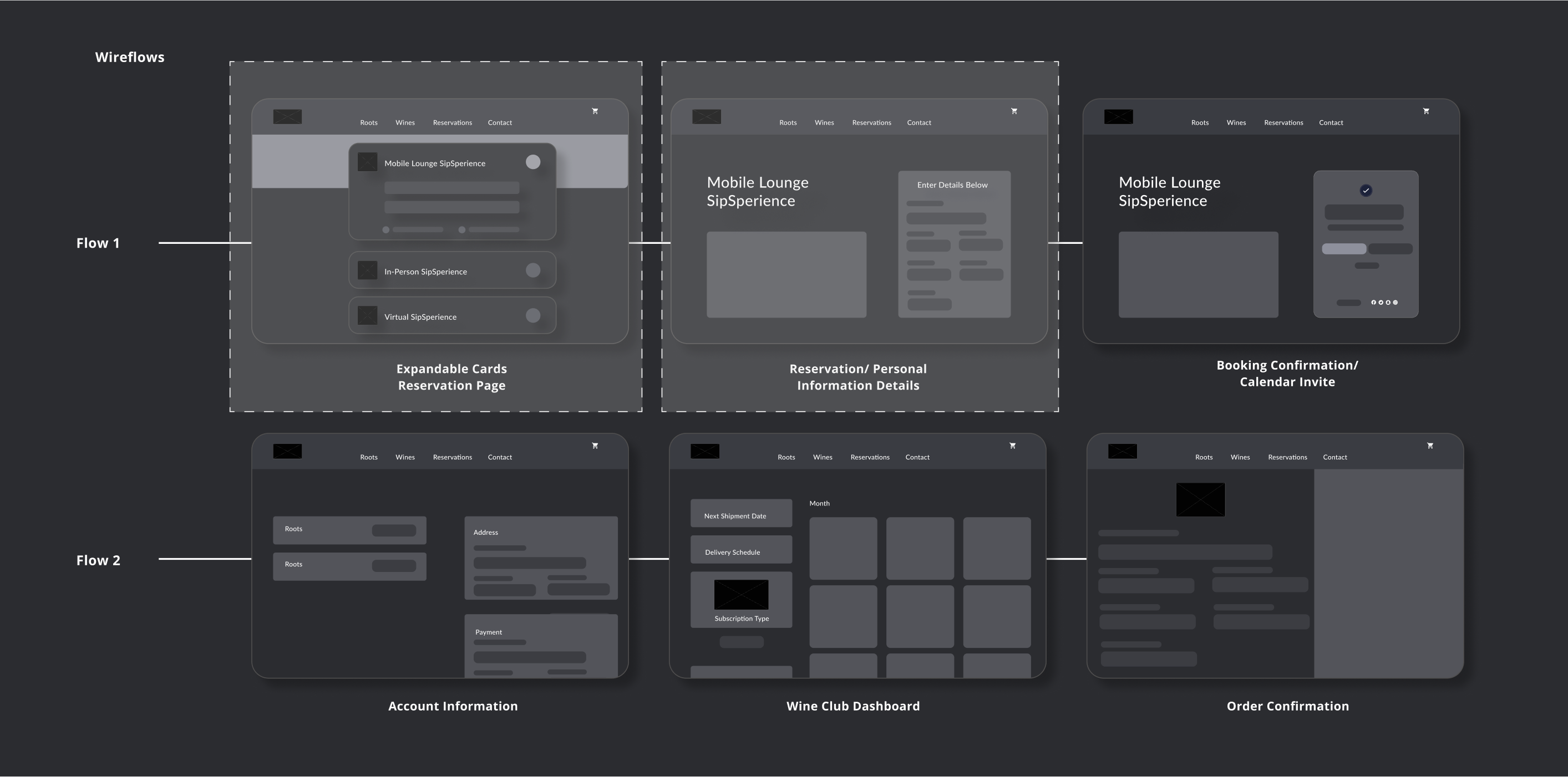
Adding reservations and refining information architecture

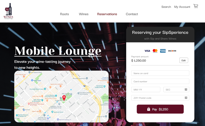
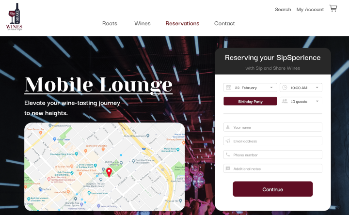
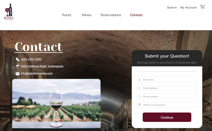
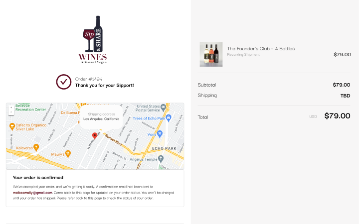
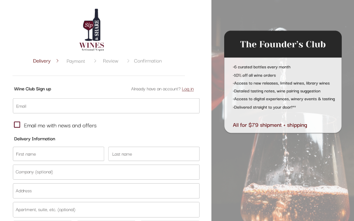
Our initial scope was to increase their number of bookings and reservations with the goal to bring more digital and in-person business.
Back to Projects
Final Wireframes of Make My Test Count
Overview

Working with a team of UX Designers, our objective was to help this business increase their digital bookings and reservations.

As a contract UX Designer, I spent 6 months collaborating with my client and a team of UX Designers to test design and create digital solutions for Sip and Share Wines.

Role

In this contract, I served as one of the UX Designer responsible for planning, conducting interviews, and creating the design solutions for the problems the business was encountering.

Tools

Problem

My goal was to simply integrate a booking and scheduling feature within Sip and Share's website.

Since the beginning of COVID-19, more businesses have moved to at least partially digital-driven business. It's become increasingly important to ensure your business is doing the best on all fronts.

Solution

We sought to integrate a straight-forward, seamless booking process within the site to avoid user confusion.

Users wanted to book with Sip and Share Wines. Not only our user interviews indicated this, but a large amount of web-traffic analytics supported this.

However, users were turned off by the lack of clarity they were presented. In order to increase bookings, we believed that by putting all the relevant information together, we would see an increase in bookings and orders.

Final Wireframes of Make My Test Count
Research and Insights

User confusion and complex site architecture posed the biggest issues for users.

Upon investing two minutes searching for a digital booking option, it became apparent that a significant issue had surfaced. The users' eagerness to reserve a table or book a special event was unmistakable. However, their frustration became palpable the moment they realized that emailing was the sole available method. A staggering 85% expressed their inclination to explore alternative options.

A vast majority of users expressed a strong preference for a seamless booking experience directly within the website itself. This preference underscored the importance of streamlining the process and eliminating unnecessary steps to enhance user satisfaction and engagement.

User Confusion

100% of users were unsure if they could book within Sip and Share's existing site

In-site Booking

64% of people preferred booking within the site rather than an external server

Ease of Use

The top priority for users when it came to booking online was ensuring ease of use
Designs and Iterations

Using expandable cards, we adjusted the bookings and reservations page into digestible chunks.

Expandable cards have gained popularity in contemporary web design due to their ability to visually break up information effectively.

By initially displaying only the essential content, these cards encourage users to instinctively engage with the page, fostering exploration within seconds. This user-centric design approach not only enhances the overall browsing experience but also empowers users to access additional information at their own pace.

Furthermore, the interactive nature of expandable cards promotes a sense of interactivity and engagement, making them a valuable tool for improving user interaction and retention on websites.

Final Wireframes of Make My Test Count

We adjusted our cards to stack horizontally to ensure they were all on the screen at all times.

If there was one thing our initial tests showed, it was that users didn't like how our initial cards took up the full width and height of the page and once expanded, some of them were out of view.

Instead, by opting the make our cards expand downward but have them oriented next to each other, users didn't need to scroll to view all the information, just move their cursor.

Style Tile

We implemented strong, sleek and feminine changes, like serif fonts, deeper colors and a renewed logo.

Aligned with the preferences and needs of her clients, we undertook a thorough evaluation of her existing design system to identify areas where enhancements could be made.

This involved critically assessing the current framework to determine how additional elements could be integrated to better meet the expectations and requirements of her clientele.

Through this process, we aimed to ensure that the design system aligned seamlessly with the desired aesthetic, functionality, and user experience goals, ultimately resulting in a more robust and tailored solution for her clients.

High-Fidelity Designs

Business needs should always supersede the client wants, but sometimes that isn't always possible.

In this scenario, all ended up working out in the end. The users where happy with the result, causing an uptick in business, leading to the client's happiness. However, that isn't always the outcome.

Whether it technological feasibility or a smaller bandwidth, sometimes you can't always have both the client and users happier. This was a huge lesson for me and something I try to keep top of mind when working.

Post Launch

After our redesign, our client saw an increase in online bookings and orders by 36% and 18%, respectively.

Following the implementation of our redesign, our client experienced a notable uptick in online bookings, witnessing a remarkable surge of 36%. Additionally, online orders saw a significant boost, climbing by an impressive 18%.

These substantial improvements underscore the effectiveness of our redesign efforts in driving tangible results and enhancing the overall performance of our client's digital presence.

Key Metrics

36%
increase in online bookings
18%
increase in digital wine orders
42%
decrease in the amount of time spent looking for key information
96%
of users preferred our redesign over the existing site
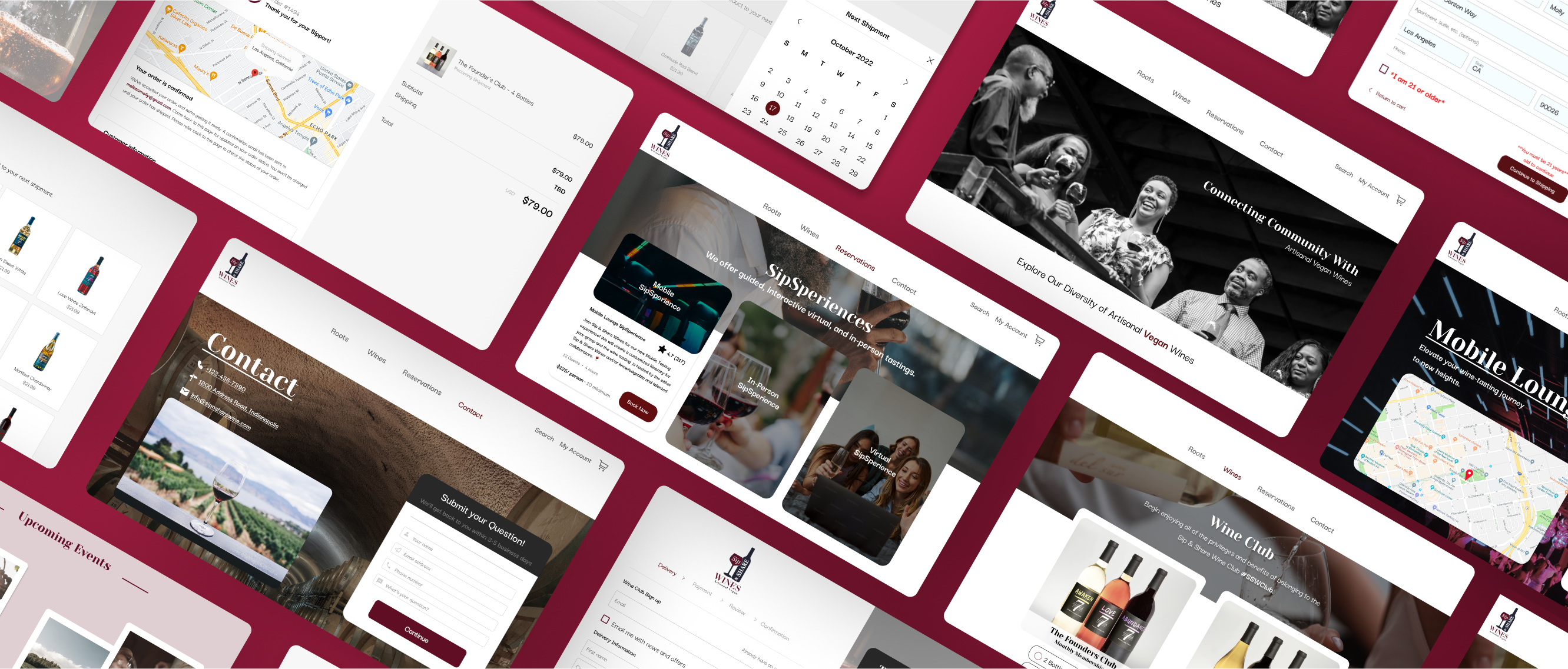
Product Preview
Figma File Prototype

Prefer to experience the prototype yourself? Click here