Non-invasive & rewarding
COVID reporting
.jpg)
Overview
As the Principal Product Designer, I led a cross-functional team to design a way to increase the rate of COVID-19 reporting.
During my apprenticeship with The Opportunity Project, I helped build Make My Test Count, a tool for reporting COVID-19 status. The goal was to create a simple, secure way for users to report their information, aiding local governments in resource allocation and improving pandemic response efforts.
Role
For this 6 month apprenticeship, I was the Principal Product Designer, where I managed a 12 person, cross-functional team of designers, data scientists and software engineers.
Tools
.png)
Problem
The FDA and US Census Bureau wanted more people to report their COVID tests, whether they be positive or negative.
But why does this matter? Well, local health teams need this information so if their is a spike in cases, hospitals and health centers can gear up with plenty of rapid tests or notify the public of an outbreak via the local news.
Solution
Reporting quick on your phone, with the chance to win money!
Get in and get out.
That was our objective when redesigning. By making the revitalized user flow as simplistic and low-effort as possible, we theorized that by incentivizing users, more users would successfully complete the flow and report their COVID test results even if they weren't comfortable sharing personal info.
This decision was rooted in our research results that showed users were money-driven into to action, but only if the potential reward outweighed the amount effort needed.
.png)
Research and Insights
App fatigue, lack of trust and user benefit were the main obstacles to users reporting.
Considering that 95% of those interviewed had some level of distrust and privacy concerns, we figured that by giving the option to skip these pages, users would feel more in control of what they were reporting.
App Fatigue
.png)
User Benefit
.png)
Privacy Concerns
Designs and Iterations
We implemented optional reporting pages for symptoms and additional information due to privacy concerns.
Considering that 95% of those interviewed had some level of distrust and privacy concerns, we figured that by giving the option to skip these pages, users would feel more in control of what they were reporting.
.png)
Icons and universal symbols for symptoms were 30% more accessible to ESL users.
With the goal of ensuring accessibility for users from diverse backgrounds, we conducted testing involving multiple ESL individuals. We discovered that while they could swiftly provide their address and other personal details, they encountered difficulties with medical terminology, particularly symptom names. To address this challenge, we experimented with a combination of symptom names and universal icons.
.png)
Users didn't know about our incentive and elements besides "reporting" were clicked on.
Problems Encountered
Our solution centered on enticing users to report their COVID results by offering an incentive that would overcome their reluctance to share private information. While our pitch resonated with a vast majority of users, a critical flaw emerged: 100% of users pointed out that they were unaware of the incentive until they reached the end of the userflow.
.png)
.png)
Adjustments Made
We made our incentive front and center for users, while additionally making our userflow start with a QR code that led users to report.
To streamline the reporting process and prevent our previous iterations confusion, we redesigned the QR code to directly prompt users to report their data, ensuring a swift and intuitive experience, akin to a presentation.Secondly, we adjusted our design so users were aware of the monetary incentive immediately, raising their awareness of why they should partake.
.png)
.png)
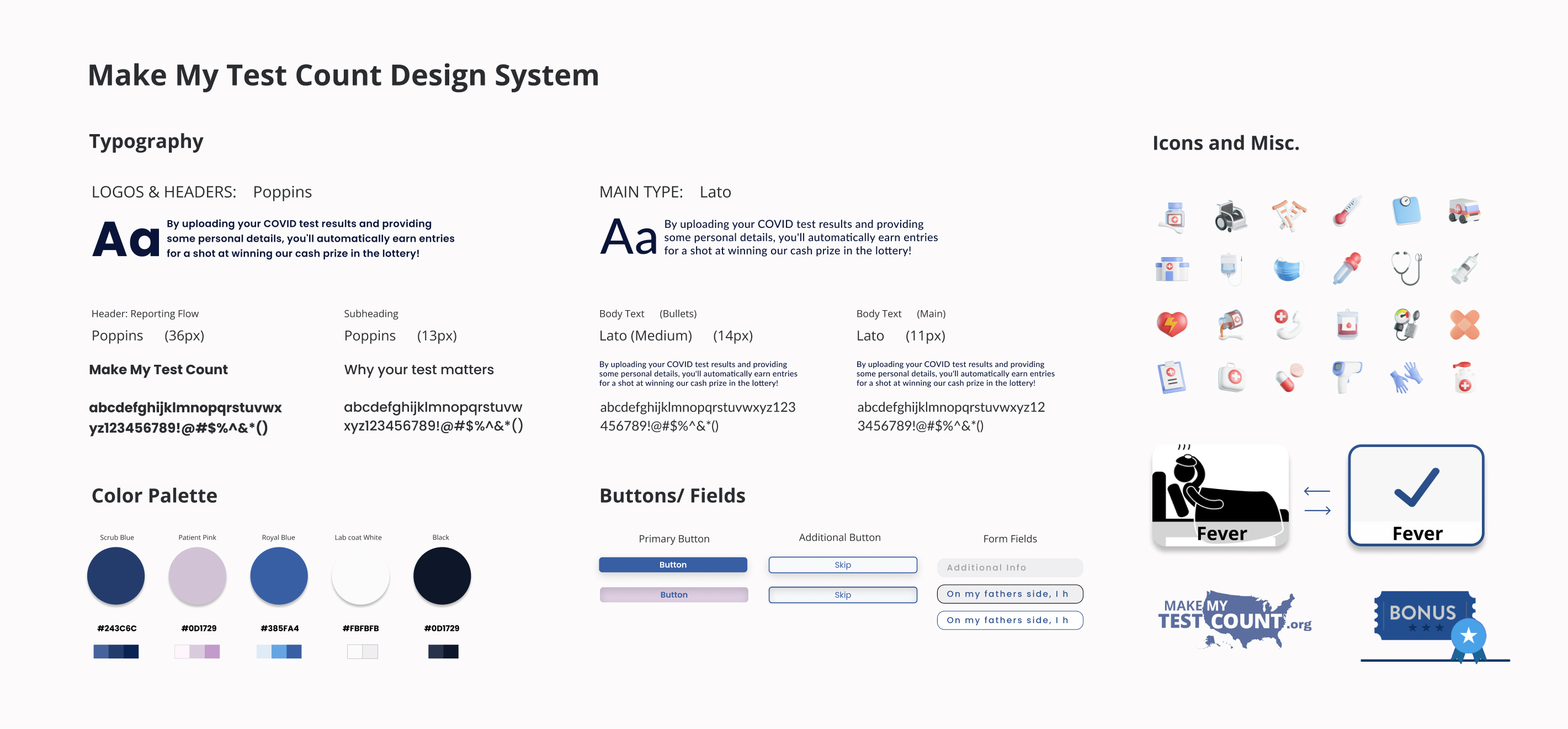
Style Tile
We wanted users to think medical and professional, with a dash of fun.
We wanted a web-based font that was versatile, readable and had a modern aesthetic. Open Sans checked all of those boxes. We used bolded Poppins for our buttons exclusively just to add some diversity and to have it “Pop.” As for the colors, we picked blues and whites as the primary colors, focusing on that scrub and lab-coat impression. This was supplemented by a light pink, an adjusted color from their existing design system.
Lastly, using subtle 3D icons throughout associated with doctors offices and medical was to add a source of fun and levity throughout the presentation.
High-Fidelity Designs
For our final designs, we adjusted the flow and layout to automatically progress, resulting in a 25% uptick of submissions.
In addition to incorporating out style tile and updating the wireframes and architecture following our testing, the last item of note we did was update our flow to progress automatically. This was designed because when users are sick, they don't want to do anything. So to alleviate this, we designed out interface to progress automatically, making it feel more like a presentation!
.jpg)
Post Launch
Meeting our users where they were was key, not bringing them to us.
To streamline the reporting process and prevent our previous iterations confusion, we redesigned the QR code to directly prompt users to report their data, ensuring a swift and intuitive experience, akin to a presentation. Secondly, we adjusted our design so users were aware of the monetary incentive immediately, raising their awareness of why they should partake.

.png)
.png)
