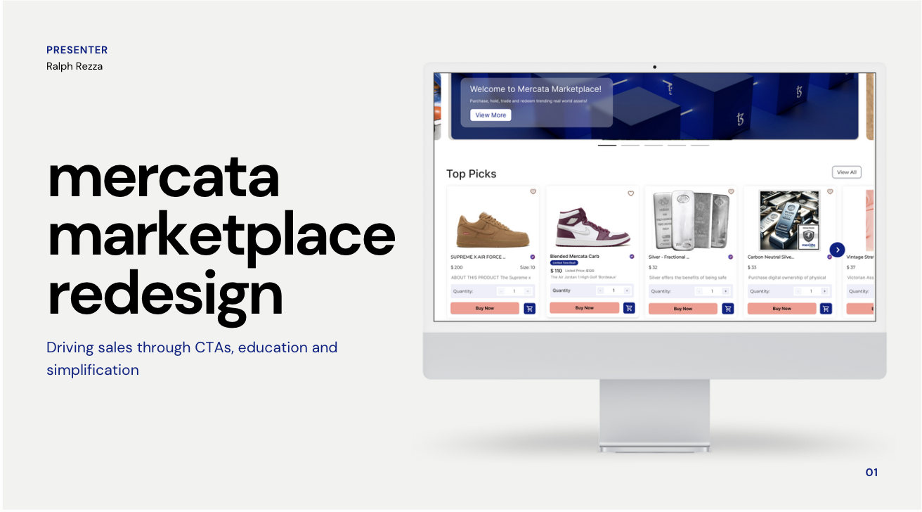
Driving sales through CTAs, education and simplification
.jpg)
Problem
Many users lack familiarity with blockchain technology and real-world assets, leading to reduced sales.
Most people are unfamiliar with real-world assets (RWAs) and the marketplace that sells them, as it's a relatively new concept. Consequently, Blockapps' Mercata Marketplace is not achieving the revenue and overall performance that the company's leadership seeks.
Solution
Drive sales sales through CTAs, education of RWAs and simplifying userflows.
I proposed that by implementing targeted improvements to their call-to-actions, enhancing user education, and simplifying the complex user flows, we could potentially see a significant increase in revenue. These strategic adjustments aim to create a more intuitive and engaging experience for users, ultimately driving sales and boosting overall performance.
.jpg)
Designs and Iterations
I revamped the product pages and marketplace with micro-interactions, engaging visuals, and streamlined info.
I implemented several key changes to the marketplace, and while they may seem small, they proved crucial in enhancing the credibility of Mercata Marketplace.
First, I redesigned the main marketplace layout to include multiple product categories instead of just one. This change allows users to navigate and scan available products more easily, utilizing sections and tags for better organization.
Next, I revamped the product cards, which previously lacked appeal and urgency. The old cards featured low-resolution images and uniform button colors, failing to attract user attention. I upgraded the images and changed the "Buy Now" button color to make it more inviting. Additionally, I introduced promotional sales to create a sense of urgency.
Finally, I transformed the product page itself by consolidating information into visuals rather than relying solely on text, making it more engaging and easier to digest for users.
.png)
Problems Encountered
100% of users said that they were confused by the existing checkout.
Checkouts. When you purchase an item, you normally get it in the mail or recieve it. However, that was not the case for the existing layout. This was confusing to users as all items were seperated in your checkout, meaning you had to fill out your information and purchase seperately. Additionally, there was no information on shipping.
It was only after purchasing something I understood RWAs. I'm basically purchasing a digital "share" of a real world item. It's like the stock market, but for collectible cars, houses real estate, etc.
You have to contact their office to get the item shipped!
.png)
Adjustments Made
Using clarifying visuals and clear information, we saw an increase in user trust and understanding.
As a person let astray, I knew what users were struggling with. To rectify these miscommunication and mailing issues, I incorporated visuals, text and verifications within my redesigns.
.png)
High-Fidelity Designs
Overall, Blockapps' Mercata Marketplace is a decent product, but it was missing key indicators that it was a reliable site for users.
Most users don't know how to put into words why a site is reliable or not. However, users know a well designed userflow or site when they see it and gives them a sense of relief and a degree of trust for the product they're using. That was the line I strove for for my redesign.
Mercata Marketplace wasn't an unusable product. It was designed just poorly enough it would scare off the users; and that was before the misconception of RWAs.
.png)
Post Launch and Prototype
Educating users about RWAs through social content and increased marketability.
RWAs are an incredible way to increase liquidity and make assets more accessible to everyone.
However, understanding RWAs isn't always straightforward for most people. By providing clear and accessible education on your site, you can retain users, instill confidence, and boost sales.

Pitch Deck
Presenting my findings to key stakeholders, I've shared my Pitch Deck below.

.png)
.png)
