Designing gamified educational content and UI for a non-partisan political tool.
Overview
As the Principal Product Designer, I led the team in crafting the overall educational and UI designs for Poliquicks and effectively conveying key information.
As the Principal Product Designer, I dedicated 12 months to collaborating with the Poliquicks team, where I was responsible for shaping the overall vision of the product. This involved designing key information to be effectively conveyed and identifying the target audience, ensuring that our approach resonated with young voters and addressed their specific needs.
Role
Since it's inception, I have served as the Principal Product Designer, responsible for conducting interviews, meeting with students, the development team and crafting the product's design.
Tools
.png)
Problem
50% of young voters (18-29) don't participate in local elections, citing mistrust and lack of knowledge as key reasons.
This was a really fascinating statistic we found through Statista. Distrust, polarization, and the absence of effective educational tools are driving young people away from the political process. Many feel disconnected and unsure about the importance of local elections and how their votes can make a difference in their communities.
To address this, we need to develop engaging platforms that provide clear, unbiased information, helping young voters feel informed and empowered to take part in their local governance.
Solution
Design a political educational app that looks to transparently educate users on politics, legislature and their local representatives.
To close the divide and rebuild public confidence, we plan to leverage AI-generated content to empower young voters in making informed decisions at the ballot box. By providing unbiased, easy-to-understand information, we can help them navigate the complexities of local politics without relying on major media conglomerates, which many perceive as biased.
This approach will encourage a more engaged and informed electorate, fostering a sense of agency among young voters.
Research and Insights
64% of users wanted to learn more about their representatives, but felt there was a lack of unbiased information.
Its a sad reality honestly.
When news is deemed as propaganda, then there is no longer a source of information the people find reliable. With this takeaway from our initial 52 survey submissions, we knew there was a market for this application. With people find their sources of news unreliable at best and misleading them at worst, we needed to develop a solution for users.
Eager to Learn
.png)
Rep. Unfamiliarity
.png)
Perceived Bias
Designs and Iterations
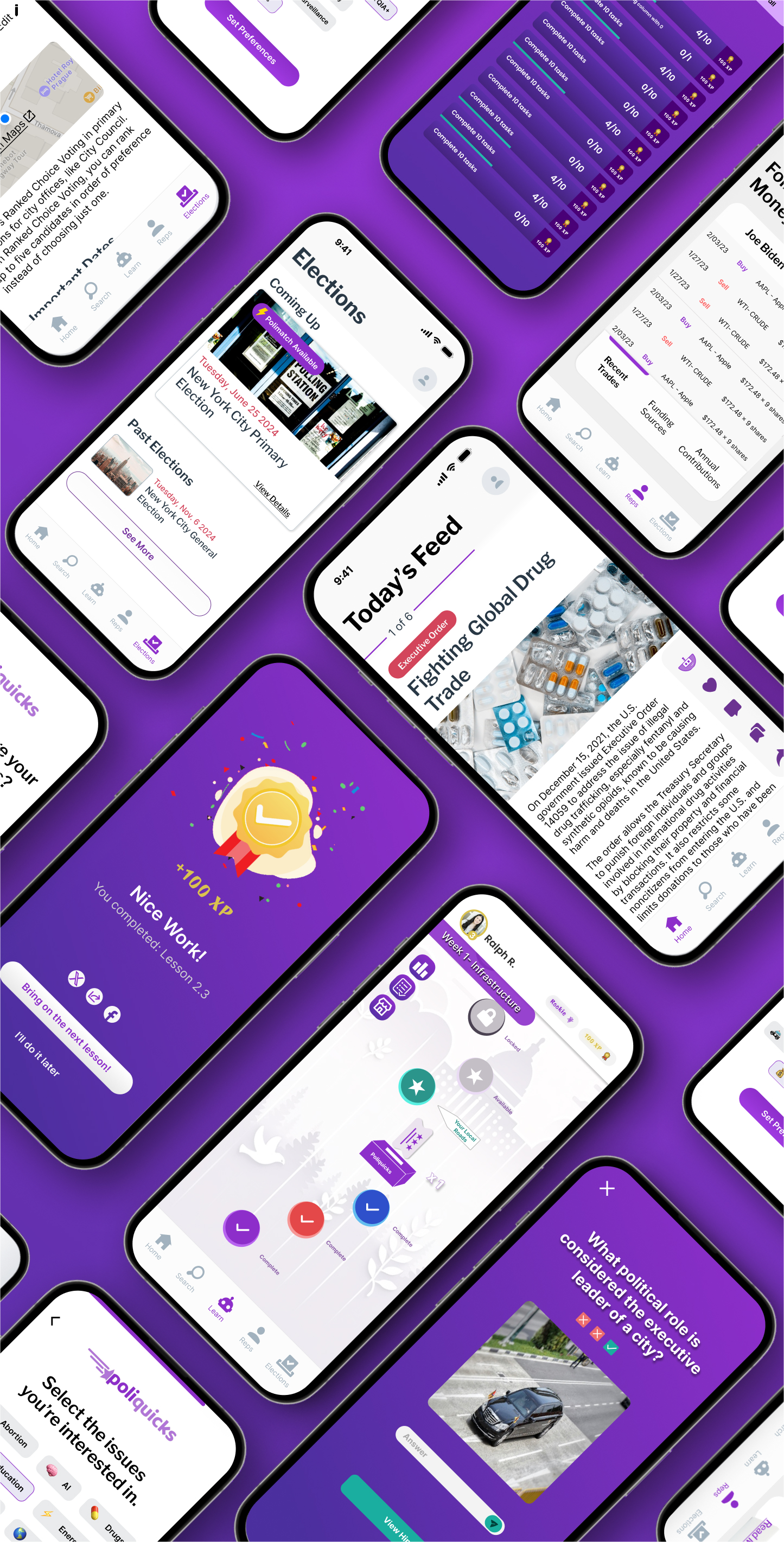
I split education into 3 primary sections: local events, matching users to politicians with similar views and a learn tab game board.
With a focus on education, our team needed to streamline the different educational features we had within our app. Although we developed other avenues like the search page and history, I'll be focusing on the three primary ones.
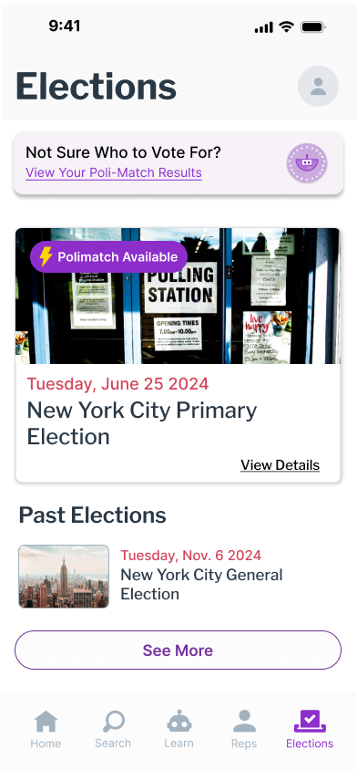
The first was local events; specifically upcoming elections. These pages would inform the user of upcoming elections in their area, the date and address as well as some items being voted on!
The second educational feature was matching users to politicians based on their views. This feature would work similar to a dating app and then provide users with additional information about their "matched" politicians.
Lastly, the general learn tab. This would function like a gameboard meets Duolingo. Every six weeks, new content would come out, where users can complete lessons and learn, with the potential to get priczes and rewards!
.png)
Instead of using dense block text, I chose to incorporate UI elements that expand and collapse, effectively breaking up the information for improved readability.
Filibuster!
Politics is a complex field filled with intricate details, rules, and regulations. But how can we present this information in a digestible way so users can not only read, but retain what they're learning? Instead of overwhelming users with everything at once, Poliquicks aimed to make content more readable.
By breaking information into manageable chunks using expandable cards, accordions, and slides, we optimized our page layout to provide structure without overwhelming users.
.png)
Problems Encountered
55% of users wanted to learn more broadly, but also stay informed of what they were passionate about.
Users expressed a strong desire to deepen their understanding of the U.S. political landscape on both a local and federal level. However, they found it challenging to navigate a wealth of news that often felt biased and overwhelming.
Additionally, they wanted an efficient way to stay updated on the topics they were truly passionate about.
Stay in my Lane

Info Seeking

Constant
Doomscrolling
Additionally, users were drawn to gamified lessons like Duolingo rather than digital "lesson-plans."
Users appreciate opportunities for learning, but younger audiences are less attracted to the image-heavy, small text formats typical of platforms like Snapchat.
Many expressed a strong preference for engaging with games and interactive lessons, similar to those offered by Duolingo.
.png)
Adjustments Made
By providing a general home feed and Poli-match, we can introduce users to content aligned with their interests as well as more general knowledge.
To provide users with a broader, unbiased view of current events and the political landscape, we developed an AI-generated home feed that delivers information free from journalistic bias.
For those interested in learning more about their local and federal representatives and how their views align with politicians, we introduced Poli-match. This feature allows users to see a percentage match with others, highlighting where their stances differ.
.png)
.png)
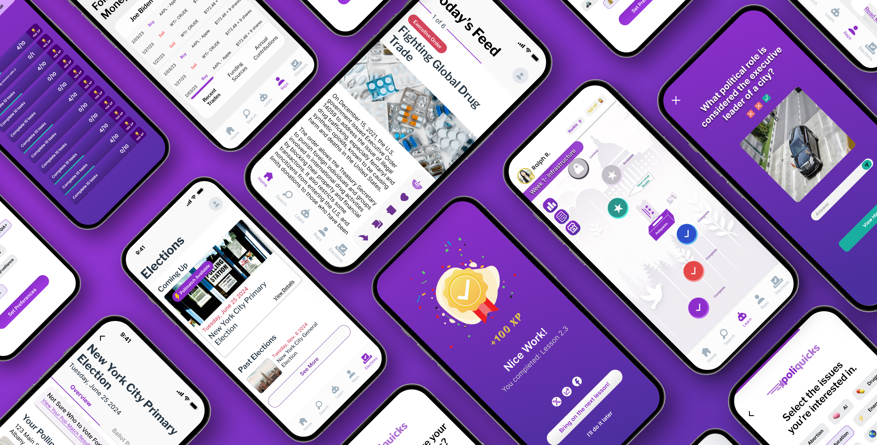
Making our learn tab include interactive educational games like matching columns, fill in the blank and audio excerpts.
Users liked games, friendly competition and micro-interactions; these were all takeaways from our conversation with users.
To best capitalize on this, we pivoted our learn tab from short-form vertical videos and slide shows to more interactive learning materials. With this, we're looking to present this within schools to help meet certain curriculum requirements for civics and government.
.png)
.png)
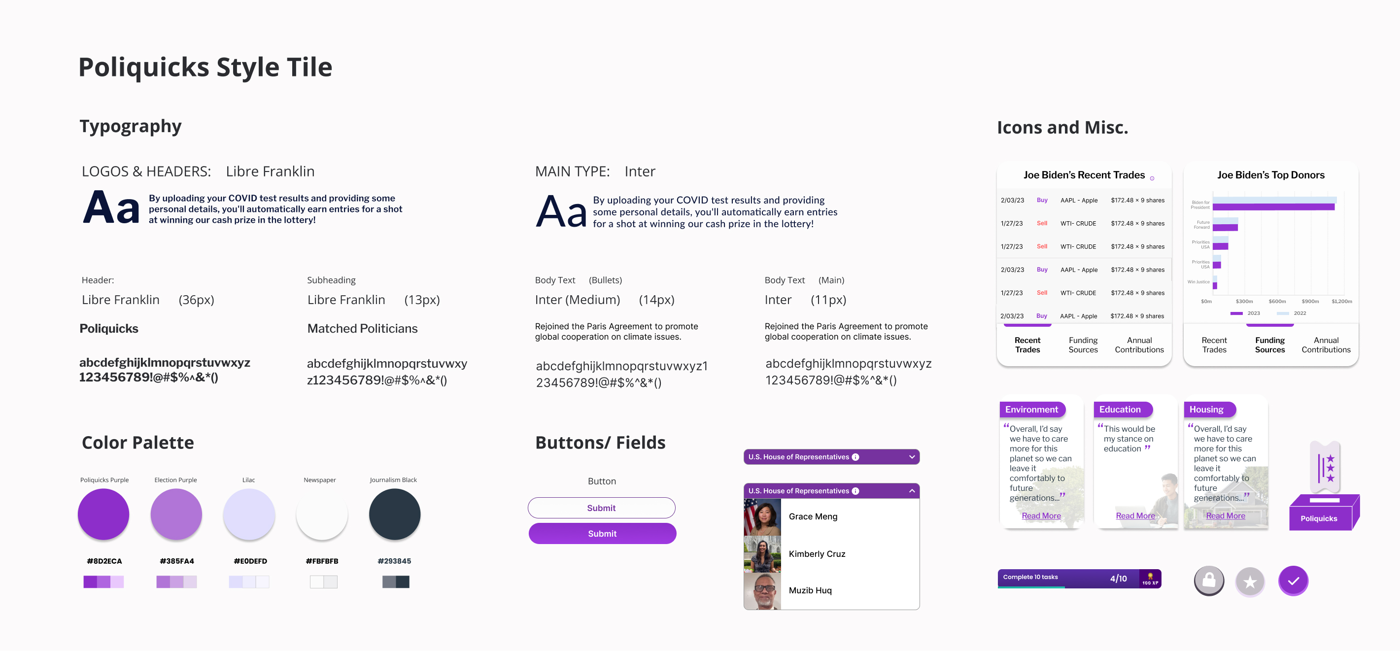
Style Tile
We chose purple for Poliquicks to avoid any bias associated with red and blue, the major party colors.
At Poliquicks, we're fighting to unite people across party lines to learn, educate and teach people about the people representing them. What better way to show unity and understanding than through a combination of the primary colors of the 2 major political parties.
As for text, wanted a font that looked like a newspaper so we picked Libre Franklin for titles and headings.
High-Fidelity Designs
By combining elements of UI, educational design and AI-generated content, we were able to establish the building blocks for a fantastic product.
This innovative approach not only enhances user engagement but also ensures that the learning experience is both intuitive and effective. By prioritizing user-friendly design, we make it easy for individuals to navigate the platform and access the information they need. The educational components are tailored to foster deeper understanding and retention, while the AI-generated content keeps users informed and up-to-date.
Together, these elements create a seamless and enriching experience that empowers users to explore and connect with the topics that matter most to them.
Post Launch
70% of people said they would use Poliquicks to get a better understanding of the political landscape, especially close to an election.
Ensuring that you are politically informed and in the loop is undoubtedly important. Elections have a strong impact on how you're able to live your life, so go out and vote.
And if you are unsure of who your candidates are, download Poliquicks!

.png)
.png)
